Don Norman, Director of The Design Lab at the University of California, describes this analogy in his book “The Design of Everyday Thinking” with the quote:
“We must design for the people the way they are, not the way we wish them to be. Also see “Don’t be logical”. Half the people in the world are below average.”
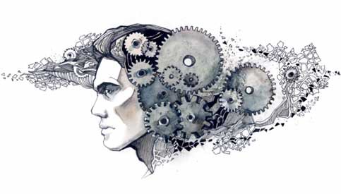
As designers, it becomes crucial to understand the pain-points of our users to build solutions that resolve their problems. The process includes understanding user behaviours and empathising with them to create a platform that increases their productivity.
To help you understand the perception of a user, here we are mentioning 5 key lessons which are extracted from the “Psychology of Design” principles. Let’s dive in!
Focus on “LESS is More” and “More is LESS” in UX Design
Imagine going to a restaurant and choosing from a menu of over 100 items. Reading through all the available options is going to take longer time than choosing from the selected 20 items. Same goes with designing.
One general conception which most UX designers have towards user design is to present your users with amazing options to choose from. While there is no doubt that people love to make a choice but having too many options can make your users confused. An average human mind can process limited amount of information at a single time.
This relates to Hicks Law, according to which people spend more time in making choices if they are provided with greater number of choices. It doesn’t matter whether they are consciously or subconsciously aware of it, the decisions made by people are highly influenced by what they think are “worth” it. Not only they weigh the cost, but it is also the benefit of the decision that Influence them to take it. This is referred to as “Cost-benefit Analysis”.
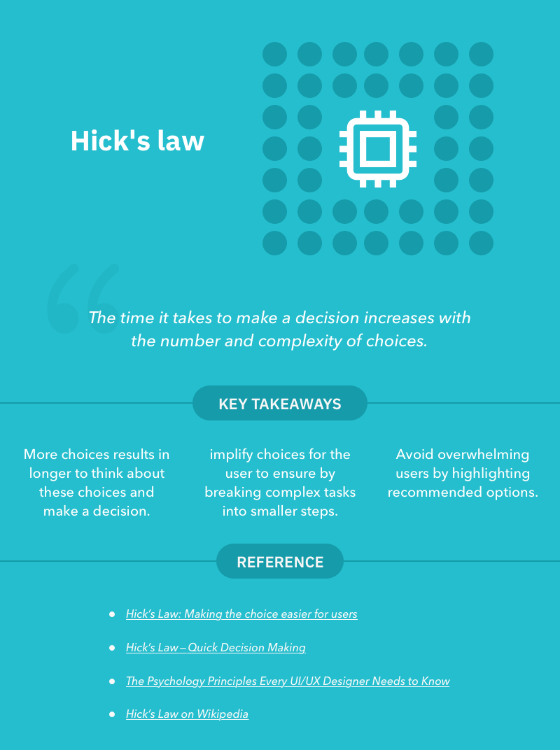
So how do you apply Hick’s law to your product design?
Well, there is only one simple rule. Designers should keep in mind that users only arrive at your website with a specific goal. Don’t ever confuse them by providing ample of choices. Remove any kind of over highlights, unnecessary links, texts, images and buttons to allow them to find what they need and make them do the action as quickly as possible without any distractions. A rule of thumb is to break down complex processes into simpler and manageable processes. Make your user navigate seamlessly by offering clear paths and spark the Aha moment as early as possible!
Keep the most important information above the fold
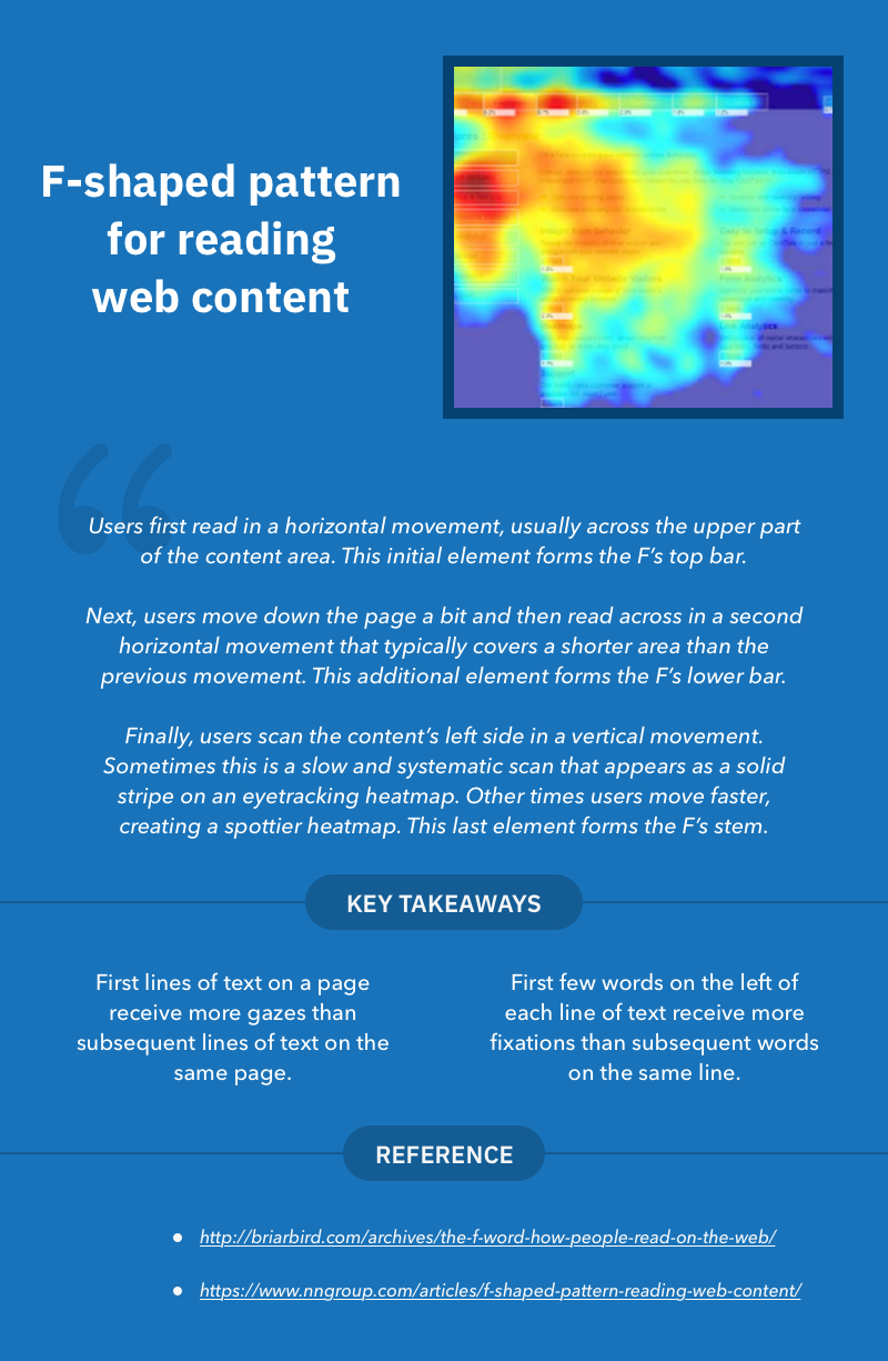
Most users are habitual of consuming the content on the web in similar eye-gazing patterns, according to the eye-tracking studies. The studies reveal that most web page heatmaps represents where the visitor concentrated their gaze and how long they gazed at a given point.
One of the most common patterns which usually forms a “F” shape which amounts for their shorter reading span. Users first scan a horizontal line on the top of the screen thereby moving down the page a bit and reading across the horizontal line which covers a short area.
According to a study by Nielsen Norman Group, which was done on a webpage of 45,237 page views, people tend to read only about 20% of the text on a page. Worse, on sites with more content, people dedicated only about 4 extra seconds for each additional 100 words of text.
So, how UX Designers could utilize this in their UX strategy? Well, one should place the information of the key importance in most scanned spots and try to use shorter but catching headlines to draw users attention.
In a world where people don’t read word-for-word, Nielsen Norman employs the following guidelines for scannable text.
- Highlighted keywords
- Meaningful subheadings
- Bulleted lists
- One idea per paragraph
- The inverted pyramid style — start with the conclusion
- Half the word count (or less) of conventional writing
Use colors carefully in your Design
Colors are the beautiful things that helps people to identify and differentiate similar objects. Psychologically, colors are what drive humans with emotions. A human mind perceive or create colors using the visual system of the brain, which means colors are subjective in nature instead of objective.
Designers generally use color as an important aspect to grab the attention of a user. It gives them a way to make connection with the branding of the product. Most of the user’s purchase timing and decision largely depends on color.
But, how can the psychology of color help a designer to create a better UX strategy?
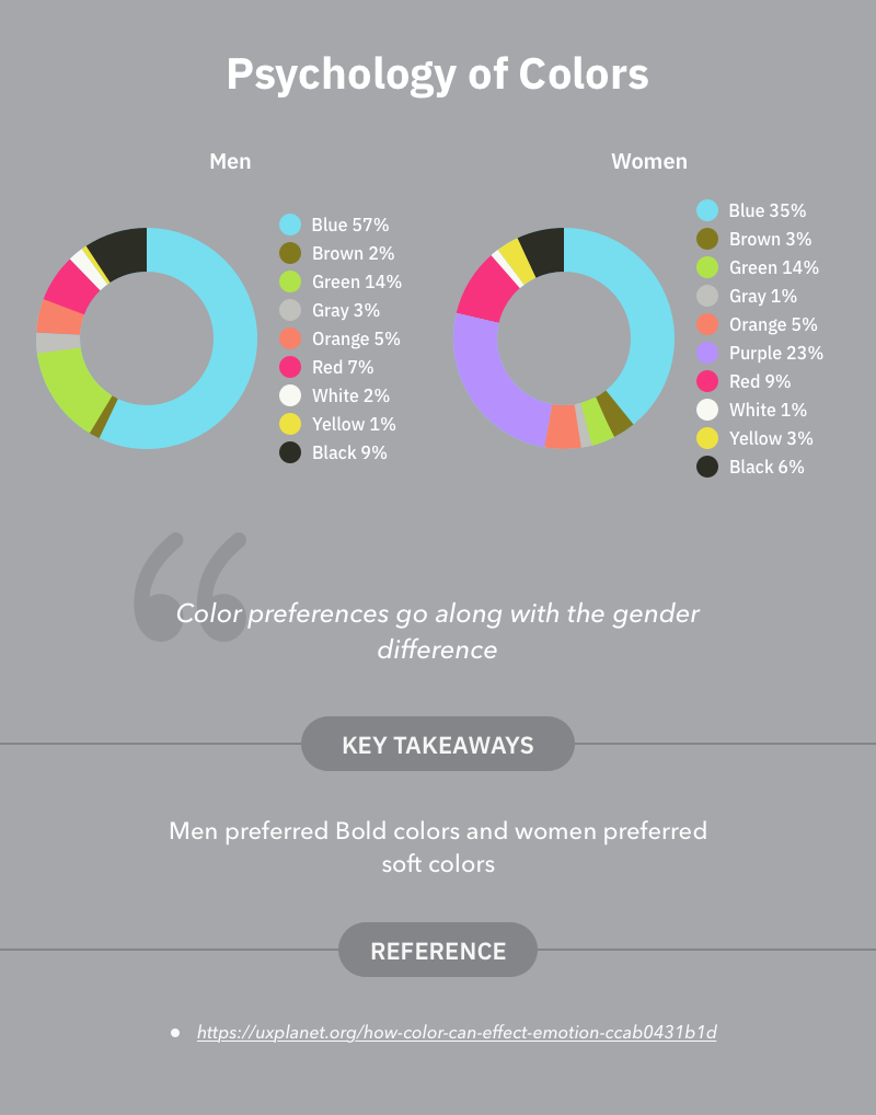
According to Joe Hallock, (Principle Design Manager at Azure), there is a significant difference between color preferences of genders. The most favorable color among both Men and Women is Blue and Orange was the least favorable. Moreover, bold colors are usually preferable by Men and soft colors are preferable by women.
These findings make it clear as to why blue is the most loved color by Designers and why Orange is used the least. However, one should not only use the colors as per likeability but also by the user-behavior and preferences.
Convey it clearly which sections are related and which are not
While designing, it makes more sense for a designer to convey organizations and associations by showing which elements are related, or not related to each other. The relation (or similarity) or irrelation (difference) can be achieved by using basic elements such as shapes, colors and sizes.
For instance, the salon’s (older) site consists of two sections which are grouped by their relative sizes.
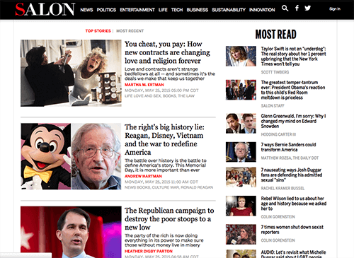
Here, users can clearly perceive two separate groups which are Top stories in the left and most read in the right. Although, both of these groups does the same thing i.e displaying articles. But, by making Top stories group as the bigger one and showing the author name with different color make users to concentrate on it.
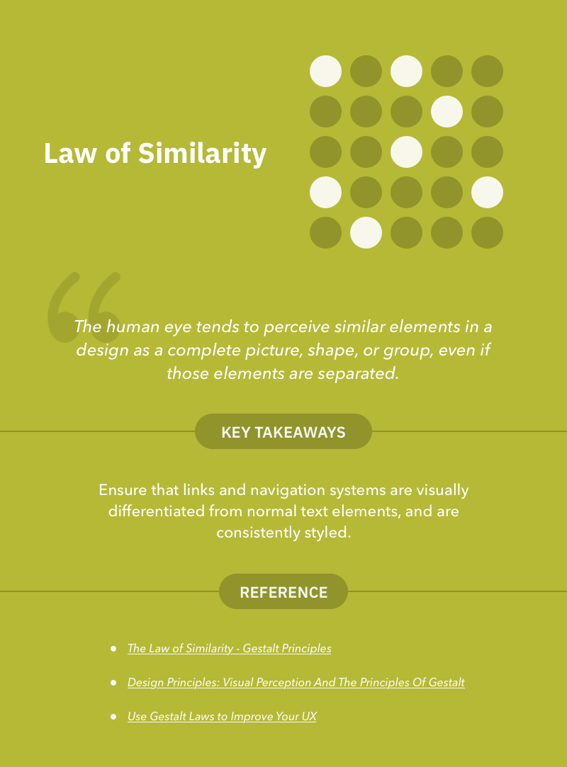
This relates to the law of similarity which means the human eye tends to perceive similar elements in a design as a complete picture, shape, or group, even if those elements are separated.”
If the above example still doesn’t convince you, let’s look at how law of similarity can be used in design to convey relationships.
Links and Navigation
Links and Navigation are most common ways to quickly navigate a site for your users. Often, readers won’t read through an entire page to find out what they are looking for. They try to find the relevant information by going through link by link or by using the navigation.
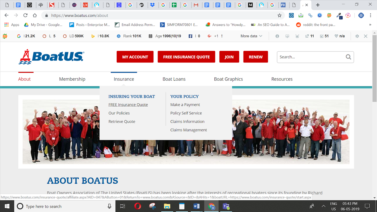
Designers use the law of similarity knowingly or unknowingly as their daily ritual of web design. The similarity rule applies to the fact why so many designers prefer to use blue, underlined links, or at least have all the links appear distinct and same as each other.
The official site of Boat Owners Association of The United States (BoatUS) use underlines and colors to depict the relationship between the group of navigation links. This allows readers to perceive similar navigation items as being related or having a similar place in the site’s data hierarchy.
De-clutter your Visual hierarchy by grouping similar things and split-up different things
Most of the clients with whom our app developers have worked with say “We want clean and intuitive app designs that impresses the user”.
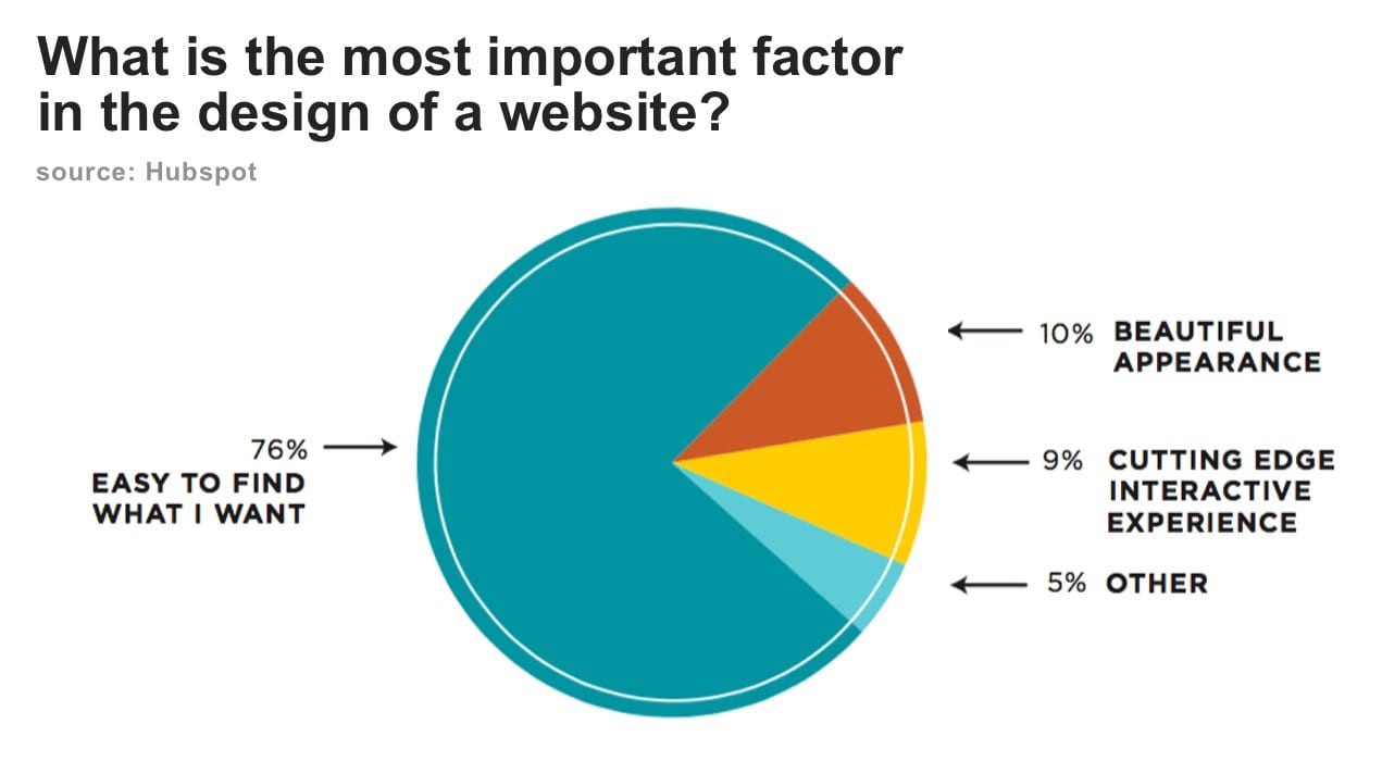
Users don’t like cluttered designs. A survey organized by Hubspot says “ visitors value easy to find information more than beautiful design or fancy UX”.
Designers should de-clutter their layouts by organizing and grouping similar elements, information or content. The correct use of these elements will have a positive impact on user-experience and user-experience.
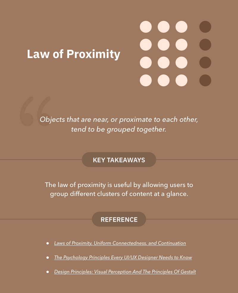
This relates to the “law of proximity” which states that elements that are related should be kept close to each other, whereas the elements that are unrelated should be kept further or apart from related ones.
There are two ways using which Designers can enhance usability using law of Proximity:
1.
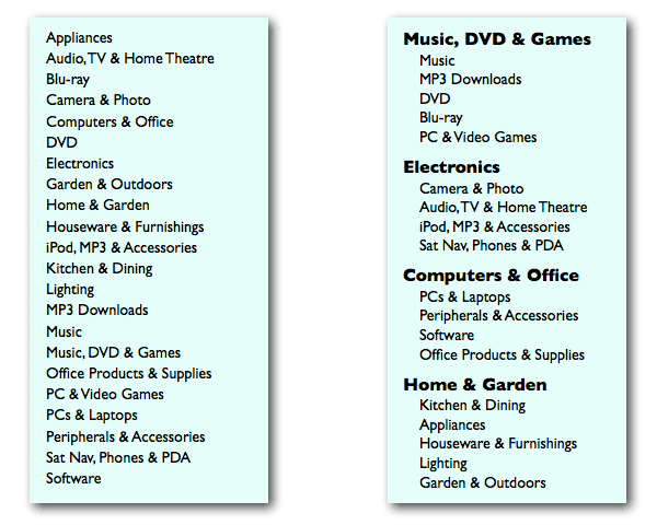
Help your users to find what they are looking for : Have you ever happened to stumble upon websites that have cluttered categories spread here and there. For an instance (see image below), say your users are looking to see the range of different available PCs and laptops on your website. If you want them to easily find the category, it’s wiser to group other related items in a part of the interface devoted to “Computers & Office” as compared to provide disorganized mess of categories shown below (left side).
2.
Build a visual hierarchy of elements to help people get an idea of how the interface is structured : Building visual hierarchies like Typefaces hierarchy, hierarchy of colors etc. can help designers or even non-designers to compose designs that are aesthetically pleasing and attract the right attention. Here’s an interesting read to make you aware on building visual hierarchies: 12 Visual Hierarchy Principles Every Non-Designer Needs to Know.
Levelling up your game of UX design
There is a saying “If everything stands out, then nothing stands out.” This applies to UX design too. Designers should not fool the users by designing things that look beautiful. In fact, they must design considering their users need in their mind. In this article, we have explained 5 psychology principles that can help you to level up your design game.
What psychology principles are you most comfortable employing in your designs? and Which one you find the trickiest of all? Let us know in the comments section.
Image credits: https://lawsofux.com/